

Data signals can be chameleons
Data signals can be chameleons
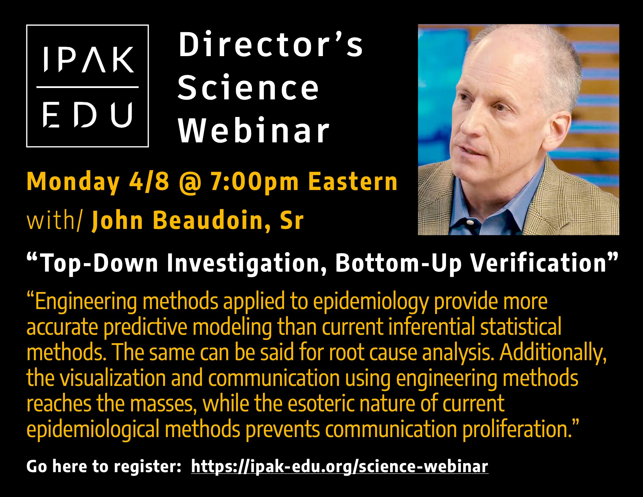
Top-Down Investigation, Bottom-Up Verification - Part 2

This is the 2nd post on the April 8, 2024 session of the IPAK-EDU Director’s Science Webinar featuring the research of John Beaudoin, Sr.
You can find Part 1 here.
One of the key messages of John’s presentation was this:
Data signals can be chameleons, hiding in plain sight.
Camouflage is a strategy widely observed in the animal kingdom, of benefit to both hunters and prey. Using color and pattern similarity, often paired with stillness, camouflage is an integral part of survival for many species.

Camouflage can be useful as a means for understanding the work John has been engaged in.
Now, if we consider that data is like the influx of input a creature receives from its senses, depending on the context, some sensory input is useful, and some of it can be confusing, or even misleading.
The manner is which data is represented, including timescale and context, relative to past trends and patterns, can greatly affect perception. Thorough analysis requires a diverse set of tools that allows one to shift perspective, like a hunter, because what may be readily evident looking through one lens may be missed through another.
Before we look at several clips from John’s presentation, here are a few concepts to keep in mind.
A graph is just a lens
Graphs are wonderful tools. They help give visual shape and form to numbers that allows for comparison, but they can also mislead.
The computer scientist, Ben Schneiderman, once said:
“The purpose of visualization is insight, not pictures.”
Depending on how data is graphed, strong and acute signals can easily mask smaller signals over longer timescales. Even obfuscated by a large acute spike, a smaller, years-long signal, is still far from insignificant. To illustrate, it isn’t hard to imagine what happens if a faucet is leaking or left open for a year: what seemed just a trickle can become a flood.
Simpson’s Paradox
Simpson’s Paradox is a statistical phenomenon which occurs when a trend is seen in several groups of data but then disappears or reverses when the data groups are combined.
To illustrate with a very simple example, consider a hypothetical town with an average population of 100 persons.
In Year 1, the town’s population was registered at 100, and in Year 2, the population was also 100.
In the first year, population starts at 100, 5 children are born, 5 adults die; in the second year, population starts at 100, 20 children are born, and 20 adults die.
If one only looks at total overall population, one might rush to conclude that the town population is stable and there are no significant dynamics at play. 100 in Year 1, 100 in Year 2.
But that conclusion would miss the very significant trends that are evident when you stratify the data. In the case of our hypothetical town, the adult death rate has actually quadrupled, and the birth rate has skyrocketed 4-fold; in other words, the birth signal and death signals are hiding the effects of the other in the total population.
Seasonality and the fiscal year calendar
In the case of respiratory disease, seasonality is well-documented. Historically, there is a regular and recurring pattern where a rise in deaths is observed coinciding with the winter season, particularly in temperate zones. This pattern is well-established.
It is important to note, however, that this pattern is not entirely consistent in tropical zones, implying that other factors apart from cool weather are at play.
For locations such as the northeastern US, the standard January thru December calendar mapping of data can hide signals since the Gregorian calendar introduces a break in the data in the middle of winter. Using a fiscal year calendar can reveal patterns that are hidden by the standard calendar frame.
A simple shift in perspective, but a vital one, nevertheless, especially in the case of the data from the states Beaudoin has examined.
An important lesson to keep in mind here is that unexamined data can be deceiving and lead to erroneous conclusions. Data can be filtered for insight. And conversely, it can also be presented in a manner—not unlike camouflage—to hide signals and mislead.
Keeping the above in mind, watch this clip from the beginning of Beaudoin’s talk.
Pattern confusion
One of the ways that camouflage works in nature is via pattern confusion. Similar patterns of color, scale, and contrast variation confuse visual perception for both predators and prey alike. A pattern, even one not precisely matched, is enhanced by stillness. Many animals have evolved very sensitive vision to detect motion for this very reason. Pattern confusion, however, often works best at a distance; on close examination, a keen observer will recognize differences.
In an analogous way, data signals can be evident at a fine-grain level, but remain obscured at higher levels of abstraction. As in the image of the flounder above, features visible close up—the fringing at the perimeter of the body, the two dark spots of the eyes—are tell tale signs; still, a predator casually swimming above will often miss the flounder because of the general color similarity and mottling pattern.
The shifting of viewpoints, to look for signs at various scales, is what Beaudoin employed when he looked closely at pulmonary embolism in the Massachusetts data. The signal was in hiding in the details, the individual records: what was needed was a filter.
As for the hunter tracking its prey, once the illusion of camouflage is recognized, tell-tale patterns are hard to ignore. Moving back up in scale confirmed the signal Beaudoin observed in the individual records; and further, there was marked increased in the time period following the jab rollout.
Watch this clip.
Comparing other causes of death, Beaudoin further reveals the rising prevalence attributed to blood and circulatory problems confirmed by the death certificates.
Watch this clip.
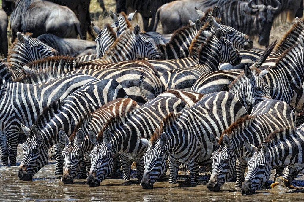
Zebra stripes
The attribution of cause of death sits at the crux of the question of excess mortality in the data, especially with regard to impact from the COVID injectable products.
Consider the camouflage strategy of zebras.
The stripes of the zebra are certainly conspicuous. The camouflage appears to achieve very little in the way of blending-in with the surrounding landscape. So what is the advantage gained?
Predators will often seek to isolate a member of the herd; that is, after all, one of the advantages of herds: large numbers enabling survival of the group. While some have hypothesized that zebra striping is a way of ‘dazzling’ the visual field of the hunter, it seems much more likely that the stripes allow individuals in the herd to blend together, making isolation of an individual more difficult. Numbers and density are harder to discern, as is depth perception and overlapping.
The signal of the individual is hidden by the noise of the herd.
The fine grain hides in the larger field of induced noise.
In the wild, animals use their senses to make sense out of the influx of patterns, or noise, if you will, to enable survival. In the human world, statistical methods and data are increasingly used to represent risk and drive perception, but how much of it is noise and how much of it is real?
Beaudoin’s experience with electrical engineering and manufacturing enabled some insight here. In engineering devices, inferential statistical methods can be employed in manufacturing optimization because the variables can be precisely controlled; but in epidemiology, there are too many variables (many ill-defined and unknown) and insufficient (or non-existent) controls.
In epidemiology, death codes become the basis for analysis. This coding is based on human decision making, and not objective measurements like speed, volume, pressure, or current.
Beaudoin argues that this human decision making has resulted in the widespread misclassification of deaths by coding, and has led to skewed data and analysis.
In epidemiology, the classification of deaths by coding can act like zebra stripes, hiding signals.
Watch this clip.
Parsing data is tricky.
And while camouflage isn’t quite an exact analogy, Beaudoin’s work makes sense out of the confluence of signals and noise embedded in the data. Like a hunter, he has become adept at reading the camouflage and using his tool set to reveal what others might casually disregard (or try to hide).
Coming up, we’ll continue to look at several clips from the full talk. Stay tuned.
Information wants to be free—and over 90% of the content here is accessible to anyone. But everything takes care and time. If you like what you see, and you’re willing and able, consider leaving a tip. Every little bit helps. Thank you!
Subscribers to the IPAK-EDU Director’s Science Webinar get full access to webinar recordings, including this 2.5+ hour session with John Beaudoin, Sr.
Your support of the webinar and IPAK-EDU makes this possible!
Check out John Beaudoin, Sr. on Substack and at The Real CdC.
Thank you.
Tremendous work in capturing the investigatory methods used to write The Real CdC and THE CDC MEMORANDUM.
Great Job!!!
Wow, to the presentation and the truly artful Substack post. How do we get more people to pay attention??? Great work, gentlemen.